Wednesday, 9 February 2011

Question Three of Evaluation

What have you learned from your audience feedback?

Throughout our audience questionnaires we made sure that we had specific questions about the construction of the movie and the way that we produced it. This enables us to break down the film in to the camera angles, music and the feelings of the audience. Overall we had a positive feedback on every aspect of our film and found that the audience enjoyed watching the short film because it has a twist towards the end which surprised them and it was a lot of action within a few minutes.

Although our audience stereotypically on average don't usually watch short films, through our feedback and watching peoples reactions towards our short film, I think we were able to show people the power of short films. Having a meaningful and hard hitting story behind it and creating a tension or strong emotion for the audience creates their involvement. When watching the film with a group of people I heard some saying how they felt sorry for the girl because she was so innocent and kind to the boy. This has taught me that people tend to sympathise with a character if its a realistic setting and story. Which means that the story that we had chosen was a perfect example for these stories.

Camera Angles

Our camera angles were chosen according to the way in which we wanted the audience to see the characters and setting for example we had a range of shots within the meeting scene from the long wide shot showing the natural lighting on the two characters and the contrast of the close up pan of the two characters first look at each other which was put in to connote the romance blossoming between them. The reason that we use these types of shots are to provoke the emotion from the audience.

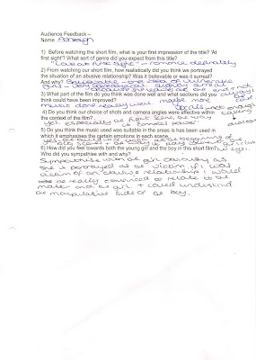
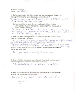
The image above shows a answer to our forth question that focused on the camera angles. It shows that the audience actually remembered certain shots that were shown through the film, e.g 'the fight scene.' This shows that the audience were effected by the certain shots that we had chosen to show within the scenes that we wanted to effect the audience. The variety of angles used also gives the audience a more entertaining viewing as it creates the tension within the film.


This taught me that the camera angles are also an important component in the production of the short film as they can be used to connote emotions and feelings that they short film is trying to convey, it also shows that a range 0of camera angles grabs viewers attention and by changing the pace and variety you are able to create tension within a film.

Music

Another aspect that we asked our audience about was the music that was added within the film. It was used to enhance the emotions and tension within the film that we were provoking from the audience. The answers that we got in our questionnaires showed us that people felt the music was well timed within the feelings and emotions of the film and that it added to the audiences reaction of sympathising with the young girls character.

Not only was the music well timed throughout the audience also showed that it was extremely effective when it began to crescendo, as it built up the tension within the film and the realisation of the twist within the plot went well with the build up of music. The answer underneath also shows us that the audience felt that even though the music build when you saw the boy it also built the tension on the 'girls bruise' scene and the 'girl crying alone' scene, in turn it provoked the audience to feel more sympathetic towards her.

This taught me that the audience are very effected by the music of a film and that the music can be used to provoke the emotions of the audience for example sympathise with a certain character. It also taught me that within a short film because you only have a little time to convey the emotions and plot of a story the music plays an important role in the development of the film. This in turn creates the atmosphere for the audience and establishes the key themes of the short film.

Impact on Audience

A large part of the development of our film was to create a story that had an important and meaningful message that spoke to our target audience, we wanted people to gain understanding of a 'touchy' issue such as abusive relationships. We wanted the audience to feel the pain of the girls character and the change in the boy.

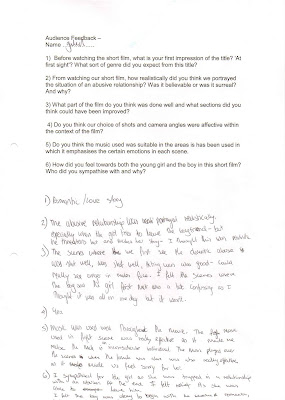
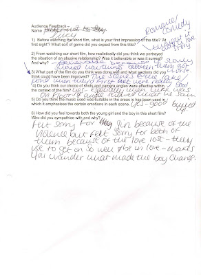
The above answer shows us the way that the audience have sympathised with the girls character because of the way in which we have portrayed the boy and the way in which we have used the camera angles for example the point of view from the girl so that the audience have taken her perspective of the situation. The answer below however shows that the audience are being challenged about the situation that we have created at Lucy answers the same as everyone else but also shows the different way that the audience could per sieve the situation we have created. She has interpreted the story involving the romantic relationship between the two characters.

This meant that we needed to produce the film in a realistic way to create the best view for the audience and to make sure that the message is sent across properly, it also enables people to relate back to our film as a realistic interpretation of something that happens in real life. The answer below shows that we achieved this by the used of mise en scene, camera angles and music.


This has shown me that when viewing a complex and complicated situation many of the viewers take on the perspective that the directors have wanted them to, for example we wanted the audience to feel sorry for the young naive girl so we showed shots and scenes of her side of the story, as well as showing her weakness against him with scenes such as their argument. A challenging and realistic situation also provokes the audience to feel emotion towards certain characters and with a topic such as 'abusive relationships' it can also grab the audiences attention due to their innocence towards sensitive subjects or issues they have also been apart of.

Criticism

An important part of the development stage is the things that we have done wrong and the way in which we could have improved on the film that we produced. By asking the audience what they thought we would be able to change within the film gives us an outside perspective of the film.

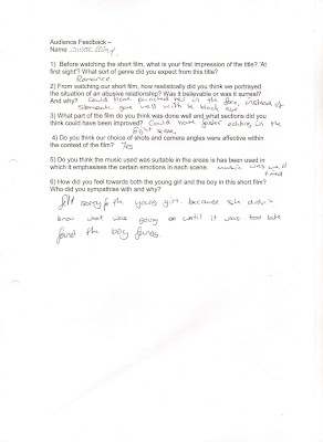
The above answer shows me that one of the key things we could have improved on was the lighting but due to the time of day that we were filming and our inability of professional lighting we were only able to use IMovie to change the lighting on individual shots. Although we tried our harder to created natural looking light with artificial light and when we wanted to use the black and white tint we chose not to do it on the natural bright lighting because it was romantic and connoted the emotions that we wanted to show. We tried to use our lighting to our advantage within the film such as the meeting scenes, but the scene such as the fight scene were very dark because there wasn't a lot of natural light and we were unable, apart from lamp posts, to use artificial lighting.


This criticism focuses on one part of the film, it is about the fight scene which is the most iconic scene throughout the whole film. We wanted to show the fight scene with a variety of shots and angles however its understandable that the fight scene wasn't as fast paced as it should have been however because the music was fitted to compliment the pace of the shots it isn't to obvious that the scene isn't as fast pace as it could have been. The viewer needs to be able to see the detail in the film as well for example Megan in the background when your seeing the film from Luke's perspective and when the close up is on Harrington's hand and the rod slides out, these small details meant that the film couldn't be as fast as maybe we wanted because it would lose its meaning.

We also wanted to know what people felt we had done well within the film to show the aspects that we had excelled through development and hard work. This enabled us to show our strengths and weaknesses through the production of our film and to give us a greater understanding of what worked and what didn't.


The above photo answer shows the reviewer giving specific scenes of the material they thought was good. They stated that the 'love scenes' where the most effective throughout the film, this may be because we decided that with little dialogue we had use other components such as camera angles, setting and music to create the 'romantic' atmosphere and the happy feelings for the audience. However the reviewer below feels that the 'love scenes' are confusing because they don't show a clear change in time and therefore development of the relationship. We could have had added scenes which we filmed that we decided as a group didn't need to be there but now I feel that it may have been a better idea for us to have them to separate the non-dialogue shots.


This has taught me that although our film uses a lot of conventions and is effective we still could have used these conventions to create a better , more effective film which would have been more tense and emotional for example if we had the fight scene at a faster pace, however I feel that although we could have changed parts of the movie overall the audience response was that only a few things could have been done better.

Conclusion

To conclude the audiences response to the film has taught me that the camera angles and music within a film play a large part on influencing the audiences reactions to the film and that although there are times that you may understand whats happening in the film due to knowing the story line it needs to be clear for a fresh audience. The audience reviews have shown me that having a variety of camera angles keeps the audience captured through their viewing, that having a meaningful message makes it easier to provoke the audiences emotions which leads to be able to experiment with music as it can be used in different ways to create different emotions.

Question Two of Evaluation

Tuesday, 8 February 2011

Question One of Evaluation

In what ways does your media product use, develop or challenge forms and conventions of real media products?
Mise En Scene
Lighting.
Within the romantics scenes we wanted to keep the natural light, the movie shows the first few scene that we had this bright light this conformed to the stereotypical view of a romantic moment in a film to be bright and 'happy' atmosphere. The bright scenes also connote their youthfulness and develop the idea of a first meeting point as it creates the romantic setting.
However as the film developed we changed our lighting, for example in the above set of scene, the part where Megan goes in to the bathroom shows the dark surrounding and the artificial light only for a few seconds which connotes the change from light to darkness. We used the darkness and outside night light to our advantage within the fight scene, as it conformed to the stereotypical view of a dark and dangerous scene within a movie that also is the height of tension.
Costume.
We focused largely on the males characters costume due to his changing character throughout the movie. His first appearance in the movie is in a suit which connotes the positive view of him and an intelligent view, which means that when we change it to the bedroom scene and he is in a casual view it also conforms more to his angry personality. And then the part where it shows the most change is in his dark hoodie when he is looming over the weaker male.
Setting.
The first location of the whole movie is the canal, which is the natural and romantic location along with the lamp post, these conform to the forms of a romantic film genre. The romantic settings also had the natural bright lighting and the calming atmosphere. The girls bedroom was stereotypical with 'girly' things around the room however the boys bedroom subverts the usual idea of a males bedroom, this challenged the way in which we showed the bedroom and in which scenes as we had to take in to account what the characters were doing. The bridge and the footpath were the darker locations of the film and they conformed to the stereotypical view and genre of a dangerous location with hedges and seclusion.
Props.
Each prop played an important part within the film, for example even the bags connoted the way in which the characters met at first sight, which was a development of the stereotypical view of a 'romantic first meet.' The phone connoted the change in character of Harri from being nice and happy to defensive and controlling. This challenges the way in which we look at the different props and their effect on the characters. Another prop that develops and conforms to making the film realistic is the make up that we used to create the bruise. The main prop was the necklace that she leaves on the pillow at the end of the film, although jewelry is a stereotypical prop for a romantic film and connotes the way their relationship changes which conforms to the conventions we wanted to show.
Conclusion
We could have used mise en scene to enhance the characters even more by introducing more props to them for example Harri could have been involved with darker things and we could have shown his darker character more and we could have focused on Megan's costume to create her as a smarter and innocent person who would 'unexpectedly' fall for the bad guy. If we were able to we could have filmed at different times to improve our lighting in the film.
Music
To begin with we used our music throughout the movie to create the development of story as well as connote the emotions and themes we wanted to portray. The beginning with the first scene of Megan getting in to the bed and falling asleep creates a calming and romantic effect which carries through to the romantic couple scenes, however the music begins to change when the girl is scene in the black and white edits which were connoting the change in theme, when she is in the bathroom the dramatic genre begins and the music conforms to this genre by beginning to crescendo, this creates the tension through out the scene and carries on within the fight scene. The use of music develops our film as it creates the atmosphere and the reactions that we want from our audience. The video above shows the key scenes that the music effects due to its building of tension and suspense, which is a connotation of the change in characters.
We could have used the music differently and when the fight scene happened we could have had it very quite which would have created a disturbing effect on the audience because it would have subvert the stereotype, however we could have also had the romantic scenes having a happier tone to show the clear change in tone and emotion.
Editing
We used the slow edits and transition fades to create a dream like effect which conforms to a romantic genre theme of being 'dream like' and a 'fantasy'. Our edits become faster paced within the tense moments of the film, for example the fight scene, these edits conform to the dramatic genre of film in which it creates tension within the film. We also had edits which looked very professional throughout the movie for example the match on action of the door handle and the phone cut with the ring tone, these added to our development as they kept the editing neat and smooth. We has much difficulty in deciding if we wanted to edit the tone of either the past events or the present to black and white. In the end we decided to have the present clips in black and white to connote the darker which shows our development of adding to the theme of the film. Although this may challenge the typical romantic drama as changing the tint of clips may be risky to make them look grainy and older but we felt that the edit looked clear and effective within our film.
The edits may have been more frequent than they should have been to create the realistic view, the black and white may look odd because its the only change in the film that establishes the past properly. I think during the romantic scene we could have edited it to look more 'dream like' with edits in between so that it established the change in time and the development of the relationship.
Camera Angles
We used a variety of angles within our producing of the film, we wanted to create the emotions and atmosphere we were aiming for through the way in which we filmed the movie. Because our film was mainly focused on the relationship between the characters the camera stayed close to the characters throughout the film with the behind the shoulder angle and the point of view angles from the girl which allowed the audience to feel the girls emotions. Even the behind shot of the girl and boy at the pond side shows the camera staying close to the characters. We used the camera angles to build tension within the film for example the close ups on the girl in bed to connote her weakness and the close ups on the boys to connote his power. We used a lot of long shots within the film to create the realistic view on the film.
However I felt that we could have used a wider variety during the fight scene to enhance the emotions that we were trying to provoke as well as showing the setting a bit more for example a wide shot to show the setting which connoted the danger in the scene. I felt we could have mixed the levels we used throughout the movie to high and low angles instead of the medium levels and the long/wide shots that we used. We also could have used pans across the romantic scenes to create the realistic view as well as showing of the locations that we purposely used.

Audience Feedback Analysis.

After the film was finisehd with all the music added we used the questionnaire method of gathering information from the audience and viewers. This is the information that we found... (by clicking on the photo you can see it enlarged.)


The first question gets the same response every time, the film's title first impression is seen as a romantic comedy or a 'love story' as Guled says. This is partially true for our film however because many people have felt it is a comedy I feel this means that the effect of the drama in the movie will have a bigger effect on the audience and will challenge their views and thoughts on the topic that we have approached.

The second question that approach how realistic our film looked also had a common response, many felt that we portrayed the relationship and its development well within 5 minutes and that specific scenes were also realistic in their actions for example Miss Hawker pointed out the jealousy between the male and the contrast of the beginning is very effective and realistic. The criticism of the realism in the movie is shown by Ashleigh who says 'its slightly surreal at the end when she leaves as that's not always the case.' This is due to how we stereotypically created the characters and the view of innocent naive girls and controlling males however we wanted to send a positive message on the movie by letting her leave.
Question three is an important part of our development as it asks the viewer what part they felt was produced well and what was not so good. Many felt that the music complimented the film well and the choice of location was also well done as it connotes the feelings throughout the movie. Oliver felt that the fight scene could have had faster edits, which when watching back can be agreed with as it would have picked up the pace even more so. Guled also felt that at the start we needed to distinguish between the different days they are together as it can be confusing that their relationship has developed, with these criticism taken in to account there was a lot of positive feedback from the selection that we questioned.
Question four was about the camera angles and shot selection within our film to see how our camera movements influenced the emotions of the film, we found that all five people agreed that we had used a wide variety of camera angles that fitted well with the scenes, we also found that the main scene that was mentioned by Lucy and Ashleigh was the fight scene with its connotations of power within the camera angles and the mixing of all different angles.
One aspect that we felt excelled our film was the music that we had in the background, we wanted it to influence the emotions of the film well and be able to affect the audience. All of our questioned viewers felt that the music fitted the film well and 'was well timed' as Oliver put it. Another scene that was mentioned a lot through the music answers was the build up of tension that the fight scene music created. This was the most important shot for the music due to it being the most emotional provoking scene.

The last question was a personal one towards the audience, we asked this with the idea that the answer would be that the viewer sympathizes with the girl the most out of the characters and it is because of her innocence. Guled wrote 'At the end, I felt relief as she was able to leave him,' this shows that our idea of creating a more positive ending was effected on the audience and that the girls character influenced the audience a lot. Apart from Lucy everyone else felt sorry for the girl because of her innocence that was portrayed and her love for the boy who is abusive towards her. Lucy felt sorry for both of them due to 'the love that they lost, as they used to get on so well and be in love.' This answer from Lucy shows us that we have created the development that we wanted to show within the movie and create a character that they can relate to or sympathize with as well as understand the situation they are in.

Holding shot steady when appropriate

- High angle well held.

Framing a shot including and excluding elements as appropriate

- Pipe in hand – framing of fight scene.

Using a variety of shot distances as appropriate

- Long shots show reality.

Shooting material appropriate to set task

- Shows meaningful story throughout the 5 minutes.

Selecting mise en scene including colour, figure, lighting, objects and setting

- Setting is clear for the feeling of the movie.

- Could have had more shots on the necklace to show the visual symbol.

- Lighting on the indoor scenes should be lighter and brighter.

Editing so that meaning is apparent to the viewer

- Black and white established the change in tone.

- Pace of editing was good throughout the fight scene.

Using varied shot transitions, captions and other effects selectively and appropriately for the task set

- Shot transitions helped establish the changes of time.

Using sound with images and editing appropriate for the task set

- Music changed throughout the film when Megan is in the bed.

Tuesday, 1 February 2011

Audience Feedback Questionaire

1) Before watching the short film, what is your first impression of the title. 'at first sight'? What sort of genre did you expect from this title?

This question is at the start of the questionnaire because it is snout the persons first impression of the movie, we have done this as one of our main aims throughout the idea was to have a twist throughout the story to show an unexpected message being shown. It will also show us peoples stereotypical view of a romantic drama film, this will help us understand if we have conformed to these stereotypes or not.

2) From watching our short film, how realistically did you think we portrayed the situation of an abusive relationship? Was it believable or was it surreal? And why?

Many short films focus on real life situations in order to pass on an important message to their viewers just like our abusive relationship message. Therefore we wanted to make the film look as realistic as possible, through key features such as lighting and camera angles.

3) What part of the film do you think was done well and what sections did you think could have been improved?

As any project there are always improvements that could have been made, it is a good way of understanding what we did well in and what we were as confident in. This helps for further projects as well as shows us the most popular parts of the movie and what emotions, themes and genres were liked.

4) Do you think our choice of shots and camera angles were affective within the context of the film?

Camera angles play a massive part in the audiences view as it's all about what they are watching, with a variety of shots and angles the film it unlikely to be boring however we had to remain focused on being realistic as well. This meant we used natural shots such as medium length shots as well as the match on action shots, which show development of our skills as well as keep it entertaining. This question will also help us establish if the differences in angles and shots have had an emotional effect on the audience as well. For example the fast pace of the fight scene with quick disorientated shots.

5) Do you think the music used was suitable in the areas is has been used in which it emphasises the certain emotions in each scene.

A lot of our music is mostly used at the tension building parts of the movie when there is more emotion to be portrayed which is why we used crechendos, the music is used mainly to provoke the audiences reaction to the characters feelings.

6) How did you feel towards both the young girl and the boy in this short film? Who did you sympathise with and why?

There are two ways of looking at our movie and it's characters. The boy can be seen as the Gillian due to his abusive behaviour and the girl can be seen as innocent and naive. However some may sympathise with the boys sweetness and argue he only acts violent due to her constant pushing and he is first to hit. This question will give us a greater understanding of how the characters are perceived and if others may feel differently to them after we have pushed them to feel one way through scenes and music.

Monday, 31 January 2011

Finished Movie


There seems to be a problem at the beginning of our film, the grey background is supposed to be black, this is a technical fault as it was black when we first exported and uploaded it.

Friday, 28 January 2011

Finished Magazine Review.

This is the finished look of the review, I feel that the colour scheme compliments each other and that the layout looks professional. The layout of the writing is professional as well as neat which gives the reader an easy read as well as a an eye catching view. The layout of the quotes and extra information is also effective with its neat layout and its clear representation. The band at the bottom of the page with the star ratings is also something different to other magazines however its a neat and effective way of showing them as its close to the end star rating in the article. Although the top right hand corner is bare with only the month and year it doesn't look like it needs something, although we tried to add and move around our information boxes we felt that it looked better the way we have it. Another decision that the group wasn't sure about is the black line graphics on the right hand page and under the title on the left. We felt that they added a stylish and professional look to the article as well as splitting up information blocks. The title of the movie is an unattractive font in comparison to the magazine title however it doe's look bold and eye catching which in turn is more important to capture the readers attention. The colour of the red which also matches Harri's shirt also look eye catching and connote the themes of the movie. The layout of the photo was changed numerous times depending on the layout of the writing, one we had decided the L shape for the writing we decided that the photo had to be a large focus of the review, having it further up also is also eye catching as its not straight bang in the middle which is captivating to the reader. The font of the actual article is also clear and easy to read, this is a big part of the article as if people aren't able to read it easy then they won't bother.
I feel that our articles layout and conventions are all stereotypical of a magazine review as well as an affective and attractive looking article that looks professional. I feel that it would attract the stereotypical audience of males and film fanatics. It gives a clear representation of the movie, the article itself is also a positive outlook on the movie that would attract the reader to then watch the movie.

The Article -
If the moving picture industry were likened to a jungle, the feature film would be the tree top canopy, bathed in the sunlight all day, every day. Television productions would inhabit the middle layer, with some shoots emerging through, but most being overshadowed by the much larger feature films. Short films would then naturally be the forest floor, sentenced to a life of obscurity away from the light, in the dirt. However, every once in a while, a diamond is found in that dirt. ‘At First Sight’ is that diamond.

The first few moments of the film are surprisingly quite cliched and generic, girl meets boy, their relationship flourishes, girl falls in love with boy. Short films have forever been criticised for their lack of story development, given the time constraints, one can understand why this problem has plagued the industry. ‘At First Sight’ however, manages to develop a relationship between two people within mere seconds in a highly believable and, at times, heart-warming manner. It is a credit to the scriptwriter’s work that they have achieved in one minute, what most generic romance films crawl through in an hour.

From here on, ‘At First Sight’ starts to pick up pace very quickly, culminating in a gripping and intense plot twist. We, at KingdomFilmsÔ, are avid film viewers, to the point of which very few films nowadays bring any refreshing and original plot turns that we have not seen before. The plot twist in ‘At First Sight’ however, will shock even the most seasoned cinema go-er. For saving the integrity of the film and one’s viewing experience, we refuse to digress more information about the plot.

Unfortunately, like most diamonds, ‘At First Sight’ does have its imperfections. Not to detract anything from the production crew, a collective of three Media students, because how they managed to put together such a quaint and professional piece of art, on a shoestring budget, is nothing short of astounding. But the lack of financial investment is quite clear in some scenes, with poor lighting being rife throughout the scenes set at night. Often causing some confusion as to what is exactly happening at times. The blemishes on this diamond could be polished quite easily, if that polish came in the form of a deep wallet. Then there would be very little for our critical minds to gripe with.

And so, as we go back to the jungle that is the moving picture industry we have to say, regretfully, that ‘At First Sight’ will undoubtedly stay on the forest floor undiscovered of the critical acclaim that it deserves. However, for the sapling students that produced this masterpiece, we can envisage them shooting to the higher echelons of the moving picture industry. We would recommend ‘At First Sight’ to anyone and everyone, for it is not so much a short film, but an experience.

Thursday, 27 January 2011

Magazine Review Conventions

During the production of our magazine review we decided that we wanted to show the conventions of the stereotypical magazine article, firstly we needed to chose a title for the magazine, Harri decided on Kingdom Films which sounds professional and realistic, we then decided to header the review to make it clear it was a short film, as most of the film magazines focus mainly on feature films, "short film corner' is a catchy and effective caption for the heading. Secondly we needed to chose a colour scheme for the review we decided to have a bright blue, we wanted the font of the title to be bold and 'technical' looking due to it aiming more at men than women. This is the first image we had of the title that is in the top left hand corner of the magazine review.
However once we had added this to the review we decided that we actually could have it red to connote the love and romance theme of the film as well as the danger,so we decided to have a deeper red instead of having a bright red.
The red colour also looks very fitting to the photograph that we have chosen, it matches the shirt that Harri is working but also looks very professional as it all fits together. This photo that we have chosen connotes the relationship between the two characters

Another typical convention of a magazine review is the ratings that the writer gives the movie, we decided in stead of putting these at the top of the right hand side page we had them at the bottom across both pages to add a bit of structure to the review as well as use it to display the information clearly.
This is the top right hand corner of the article with the date in a clear blue font that looks professional and the graphic of a black line with a slight fade that goes from the slogan ' short film corner' to the end of the right hand page. This looks professional and breaks up the page a bit more to look more professional and formal.

The layout of the writing is designed like a stereotypical review, it is formal and neat as well as all measured the same, we felt that this was meant the focus on the image was also made aware because the text wraps around it. The article also has an attractive look as it is all layerd out in a professional fashion.


The information box is also a very important convention of the magazine article review, it consists of the important information that people wants to know first. We first had it included in the blue theme before we decided we wanted it to look more formal, it was placed in the right hand corner of the right page. With some deliberation we decided to change this to a black formal font and to have it in bold font as well. We also then added another graphic line with a deep fade to section it off from the title. It fits and looks neat as well as professional.


Every article that we had reviewed had a quote from the review in a larger coloured text box that was effective and stood out. The colour again fitted our colour scheme and looked formal and professional. We chose the quote well because it was an eye catching quote.
This is the smaller quote that we have used to integrate in to the image, it looks neat and clear with the blue font and white background. Its position in the right bottom hand corner is also clear and professional.
This is the last part of the written article with the verdict of five stars (*****) it gives a clear indication to the reviews main feature of being an excellent film. It also looks professional and neat at the end of the text.

Tuesday, 25 January 2011

Finishing Touches To Film Before Music.


This is the final edit that we had after we added titles and credits however once we were watching it back we felt that it needed to be tweaked again and there were a few things that we decided that we wanted to change. We felt that the beginning of the movie starts to abruptly and that we needed to have a production company introduction instead of the actual film starting. Our production names are 'Oakgrove Film Network' and 'LoveLifeFilm' which would appear on the the screen before the names of the actors however as we placed them in the right hand lower corner of when Megan is getting in to the bed we felt that the start of the movie starts to abruptly and we wanted it to have a different starting to ensure that the audience are eased in to the movie. So instead of overlapping the production names and the footage we decided to fade them in and out on a black background at the start of the movie. We had them in a white formal font which focused in and then out after 3 seconds, we then added a fade before the movie actually started, we felt that this gave the movie a more professional appearance.

We then decided that the first shot of Megan getting in to bed was then bare as the names started when they were walking so we moved the 'Megan Towers' to when the zoom in and close up of her face comes up in the bed and then we added a shot of Harri standing at the river side lighting a cigarette after the fade to bring up his name. We moved both the names to the left hand lower corner and then changed the italic font to a formal font which again looked more professional.

Whilst we were watching the movie through we decided that a few scenes needed to be changed, the scene when they walk in to the room for their anniversary there is a few seconds when the two are standing awkwardly and it creates an uncomfortable shot so we have cut it as far as we can without looking strange or disturbing the dialogue. Another part we felt was disorientated was the way that when she is looking in the mirror in the bathroom it then cuts to her coming back up however the camera has moved from the first to the second shot and it doesn't look smooth. We decided to remove the first shot of her looking in the mirror so that it flows smoother from the shot of her turning the tap on to looking up and the audience then seeing the bruise. Another problem that we noticed was the sound in the last fight scene shot where you see Megan running away still had the background sound in which isn't meant to be there and it meant to be sound effects instead.

The last part we needed to edit was the second to last scene when Megan is getting out of the bed because it is to long and doesn't add to the story until she places her necklace on the pillow. However because we had the credits running through this part we had to change the end credits. However we didn't want to have the last shot to be Harri so to add depth we had a close up shot of the necklace. We now have them over a black background at the end that fade in and out again this looked more effective and professional. We added scrolling credits for the rest of the information but then we felt that they didn't add much to the professional and serious look that we were wanting so we had the producer logo at the end which is LoveLifeFilm.


After we had the credits sorted and the production label finished we feel that the movie is ready to have the music added.

Wednesday, 12 January 2011

Magazine Review Analysis

Empire magazine has been focusing on reviewing and distributing movie information since 1989, unlike other film magazines it isn't as serious and formal but instead with its focus on telling the audience the information they need to have an over view of the film.Empiresaudience consists largely of males as well as film fanatics who are wanting as much understandable information as possible as well as photos for visual purposes.


This article is very much orientated around the photo which is large and bold but also very relevant to the movies setting. The font is small and plain black to be easily read off the page and the blue and yellow colour scheme is also very simple but eye catching and the same through out each page.
The title isn't as large or bold but it is integrated over the photo and under the title is the information about the movie such as director, released, certificate, running time and plot. This is important for people who want short quick information of a film to see if it would be worth watching for their own reference.
Quotes around the page have been made in to bold with colour font and background to stand out against the photo which they also overlap. It is a very precise quote that has been taken from the review that sums up the movie in a positive light.
The LOOK CLOSER part of the photo gives facts that the film wouldn't have told you before and gives 'secret' information to the audience to further their knowledge of the film. The bold yellow that contrasts with the photo and then is stands out which makes it eye catching in the page.

The key to the ratings run across the top of the photo in a small font and at the end of the article which relates to the ending of the article.
The verdict is the full opinion of the writer and the rating of it is also at the bottom.

The article itself is full of puns and jokes that are used throughout the article to entertain the readers but they don't distract from the seriousness of the films plot. The plot is laid out throughout the article to introduce characters and themes aswell as gives the writers opinions and feelings from watching the movie. The article also has quotes from actors and directors from the film that show their opinions and feelings towards the movie, it gives a positive review of the movie to enocourage people to watch it themselves. Techniques such as rhetorical questions and jokes are used to keep the readers attention throughout the article.


Saturday, 1 January 2011

Finished Movie Poster

The poster feedback that I got after uploading them all on to Face Book to see the range of comments that we got was interesting to see how people felt towards each one, some felt that we needed a punch line or slogan to add to the poster to capture the plot of the movie as well as create the theme of it. We decided that we needed something romantic to attract the audience that we were aiming at, 'all great loves come to an end' and 'young love is the most dangerous' were some that we had thought of before deciding on -
'every great love starts at first sight'
we felt that we weren't give to much of the movie theme away but we were suggesting that there may be a twist in the plot.
We also needed to add the 12 certificate which we felt placing the movie as a 12 was the best as it did involve very important and violent issues but it also was appropriate as it didn't have so much violence and 'gory' images.
I also made the image portrait to conform to the typical layout of a movie poster which is easier to display and more pleasing on the eye.
This is the finished image for the movie poster...


I feel that the lighting and the contrast between the background and the focus of the characters embracing is very effective, because they are shaded in black and white it create the effect that they are more important and have a large focal point. It also creates the idea that something bad happens to each of them because the black and white connotes a very dark and negative view. The positioning of the characters within the image is effective because its eye catching and as they aren't in the middle it creates the pleasing effect. The layout of the writing is also effective because it shows well through the bright background and its easy readable. Although the photo is grainy and not very focused it was the best photo to use because of what is happening in the image it connotes love and romance which is a key theme in the film, which contrasts with the black and white.