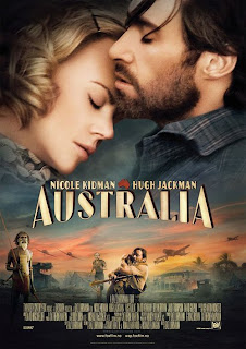
 Australia's movie poster gives a clear indication to the two main character as they are about the actually title, which is more centre to attract more attention, the bottom of the poster gives a indication to the drama factor of the movie with the clips of confrontation and war images. Although there is a aspect of romance in this part of the bottom sector as there is a embrace between the main male character and what we presume as the female main character, the embrace looks desperate and very strong which connotes that they are scared and she is being comforted by the strong male figure. The large and main focus of the whole poster is the two characters head shots, the way that they are moving towards each other on the inside suggests their close relationship with each other as well as the way that she is leaning further towards him for comfort. They both have their eyes closed which also suggests a romantic side because it softens their faces and creates emotion for the audience. It connotes a struggle the couple may have to overcome in the movie as well as the relaxed feel of being together. The way that the man is higher than the woman shows his power within the relationship and her need for him as well as the wind that could link with what the title implies. (that the movie is about a dramatic event in a Australian place) The colour schemes of the poster are very pale and soft which connotes the softness of the relationship as well as making it look like dusk which also connotes the ending of something. The font and colour of the title doesn't attract a lot of attention as it doesn't stand out and it isn't bold or bright, however this doesn't mean its not effective because it blends in with the whole theme of the movie and poster, calm and soft.
I like the poster because it shows the passion between the couple in the way they are positioned and their connection is very clear, I think we could use this in our poster to show the deep connection between the couple as well as use bits of the film to portray what its about, I also think that the colour scheme of the pale and soft colours relates well to the romantic theme. We could use this as template for our poster as it shows the two main characters passionate relationship but also gives a little detail on what the film is about.
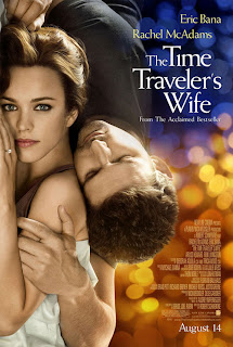
 The Time Traveler's Wife movie poster is a different take on the showing of a passionate and loving relationship, the way that the female character is the main focus in the poster due to her eye contact with the viewer shows a softness in her eyes and a little sadness. The way that the photo is on the left side of the photo and it spans the whole length because the viewer doesn't naturally look in the centre of the photo. The movement in the photo gives a natural movement that looks loving and comforting, the male is coming above the women which connotes his power but its contradicted when he is closing his eye to connote weakness. Another connotation of the females positioning is that she is clearly showing her wedding ring finger as well as looking like she is covered by a sheet, this could connote their close relationship as well as their status within the movie. The males positioning in the poster also gives him a sense of softness as he is protecting her as well as holding her softly, another connotation is the way that he is holding his hand to her head, which also suggests their loving, caring relationship. The fact that they are also in focus whilst the background is in a blur gives another connotation that they are important within the movie. The colour scheme of the poster is very dark to very light with the blurs looking like flashing lights, the colourful background also connotes that man being dark and stronger whilst the colour changes as it travels to the women and it changes to a lighter yellow colour which also connotes her weakness and femininity. The font in the poster is white which stand out behind the darker blue background, the way in which it changes also gives a neat layout, its also a 'posh' font as well as having the actors names also close to the title. The title also neatly fits together and isn't all in one straight box but instead is in moved around which is nicer on the eye.
I think that we could take from this poster the way in which the photo is to the side, we could use our photos of the couple to position them in a different way instead of making them the central focus, also the way in which they are in focus whilst the rest of the photo is out of focus makes it eye catching and nicer on the eye, it also gives a soft and sweet feeling.
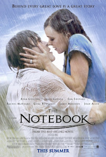
 The NoteBook poster is mainly the large photo which focuses on the main relationship within the movie, it gives a dramatic and romantic feeling already at just a first look. The photo of the couple is very romantic, the male is once again taking charge with his arms holding up the female in the shot, however this is then contrasted as he is looking up longingly at her, with his eyes closed which gives a romantic and loving emotion. The female positioning is higher than the males which could connote her power in the relationship but it also shows her looking down on him grabbing his face with her hands which shows a struggle and need for him. The lighting also gives the couple a glow around them which could also connote them as supernatural or giving them a certain power in the poster. The background blends in with their costume which and the 'kiss in the rain' gives a romantic and passionate event which gives the viewer a feel for the whole movie. The colour scheme is soft and pale with pastel colours in the background as well as in their choice of clothing, the natural colours connote innocence and love. The positioning of the couple isn't however totally centre instead they are slightly to the right, this makes it pleasing on the eye and easier to look at, they are also at a slight angle which is going against the angle of the rain fall. The title is in a sweet and simple font which links well with the photo and the sub-note at the top of the poster also gives a clue as to what the movie is about. There is a lot of other information on the poster however it in smaller font.
I think that the poster gives a very romantic view on their relationship and it also looks very passionate. I think that the positioning in the poster could also be the same as in our, I think that we need to show the couple in two different lights, their happiness and their dramatic side.
Another thing that i thought would be useful for us is that take a few ideas from very short film clips that are used as adverts to advertise Chanel No 5 perfume. Even though they are focusing on advertising they still produce very good posters as well as short films. I think that this will give me an even better understanding of how to use a poster to promote what we want to portray as well as the positioning of photographs and text. I have analysed the poster as well as added the short movie 'advert' that it has come from.
The Audrey Tautou advert poster gives a very calm image as the spotlight is on the female, the body language of her stretched pose also suggests lust and gentleness, and it also connotes softness and femininity. Even though it’s a promotional poster its text in white contrasts with the darkness of the photo, as well as its positioning not being straight in eye view makes the viewer wanting to see. The lighting in the photo is very effective, the darkness in the photo connotes romance as well has having the spotlight on the women coming from one side and 'lighting' her up. The setting is also very romantic and 'old' with the typical romantic drama setting of an old train, her costume is also very romantic in a slip dress which is very feminine.
The Nicole Kidman poster is also effective in showing a more dramatic approach; it has her in a closer up position as well as having her head turned. The way that she is turning as well as the hair that is going across her face connotes panic and distress as well as elegance to the photograph. Again even though the text is promotional and white is also again a contrast with the darker background of the photo. The background is not in focus with the lights blurred and it gives a clear indication to the panic that she is going through. Another connotation of the poster is that her outfit is also pale which connotes softness and femininity.
We have decided as a group to each create our own posters and then come together and use all the different ideas to create the best poster that we could. We have chosen to do this so that we each have an opportunity to create our ideas instead of explain them because sometimes explaining them doesn't help and having them visual will help.
I have chosen to go with two very clear cutting photos that aim to give an emotional reaction to the movie as well as portraying the themes of the movie, I want to keep the posters dark and original and the photo I use I don't want to be to posed. The australia poster I liked because of the film footage being used as photos as well as the main focus of the two characters. I think I could incorporate this in to one of my posters for example having them


No comments:
Post a Comment