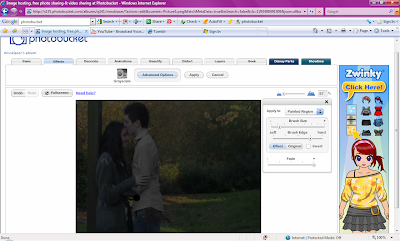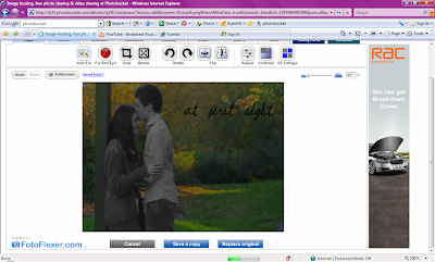
I am using Photobucket.co.uk to edit my photos and turn them in to movie posters this is because it gives me a lot of choice on the edits and effects that I can use as well as a wide variety or texts and its easy to use. The first photo I chose was of them at the pond, this was because it showed the romance and light hearted part of the film which would attract audience but I wanted to twist it, in the photo above the picture is very dark and dull so I decided to bring the brightness up to show the natural colours of the background however because I wanted to have the suggestion of darkness within the poster I painted the two characters black and white with the background, this was so that they stood out. This is shown in the photo below.

I then began adding text which I had to one side so that it didnt over lap the photo. I brought the brightness up a bit more after the black and white was finished so it stood out more, I did this using the contrast section. I decided to go with a italic and 'cute' font for the poster because it was eye catching but also girly (which is our main target audience). I decided to put the names under the title and then at the bottom there is the extra information about the movie. This is all shown below.

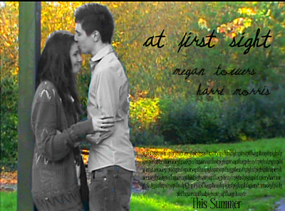
The finishing poster looked like this ...
I think the poster is eye catching and interesting with the contrast of the black and white and colour, it makes them stand out but also makes the audience wonder why its them in black and white. Another thing that I like about the poster is the placing of the title and text along with the positioning of the characters, it is neat and eye pleasing. I think that the natural does look pretty in the background although its very bright but once again it adds to the attraction. I also feel that the font stands out.

No comments:
Post a Comment