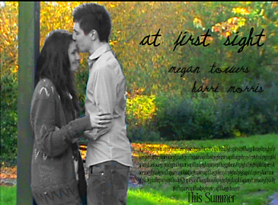
The finishing photo looked like this ...
Wednesday, 29 December 2010
Movie Poster Idea 3
The finishing photo looked like this ...
Movie Poster Idea 2
Tuesday, 23 November 2010
Movie Poster Idea 1
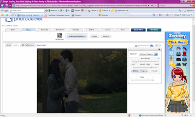
I am using Photobucket.co.uk to edit my photos and turn them in to movie posters this is because it gives me a lot of choice on the edits and effects that I can use as well as a wide variety or texts and its easy to use. The first photo I chose was of them at the pond, this was because it showed the romance and light hearted part of the film which would attract audience but I wanted to twist it, in the photo above the picture is very dark and dull so I decided to bring the brightness up to show the natural colours of the background however because I wanted to have the suggestion of darkness within the poster I painted the two characters black and white with the background, this was so that they stood out. This is shown in the photo below.
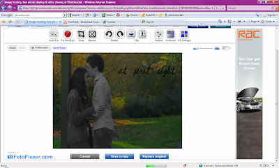
I then began adding text which I had to one side so that it didnt over lap the photo. I brought the brightness up a bit more after the black and white was finished so it stood out more, I did this using the contrast section. I decided to go with a italic and 'cute' font for the poster because it was eye catching but also girly (which is our main target audience). I decided to put the names under the title and then at the bottom there is the extra information about the movie. This is all shown below.

The finishing poster looked like this ...
I think the poster is eye catching and interesting with the contrast of the black and white and colour, it makes them stand out but also makes the audience wonder why its them in black and white. Another thing that I like about the poster is the placing of the title and text along with the positioning of the characters, it is neat and eye pleasing. I think that the natural does look pretty in the background although its very bright but once again it adds to the attraction. I also feel that the font stands out.
Monday, 15 November 2010
Analysing Existing Romantic Drama Movie Posters.
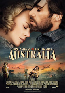 Australia's movie poster gives a clear indication to the two main character as they are about the actually title, which is more centre to attract more attention, the bottom of the poster gives a indication to the drama factor of the movie with the clips of confrontation and war images. Although there is a aspect of romance in this part of the bottom sector as there is a embrace between the main male character and what we presume as the female main character, the embrace looks desperate and very strong which connotes that they are scared and she is being comforted by the strong male figure. The large and main focus of the whole poster is the two characters head shots, the way that they are moving towards each other on the inside suggests their close relationship with each other as well as the way that she is leaning further towards him for comfort. They both have their eyes closed which also suggests a romantic side because it softens their faces and creates emotion for the audience. It connotes a struggle the couple may have to overcome in the movie as well as the relaxed feel of being together. The way that the man is higher than the woman shows his power within the relationship and her need for him as well as the wind that could link with what the title implies. (that the movie is about a dramatic event in a Australian place) The colour schemes of the poster are very pale and soft which connotes the softness of the relationship as well as making it look like dusk which also connotes the ending of something. The font and colour of the title doesn't attract a lot of attention as it doesn't stand out and it isn't bold or bright, however this doesn't mean its not effective because it blends in with the whole theme of the movie and poster, calm and soft.
I like the poster because it shows the passion between the couple in the way they are positioned and their connection is very clear, I think we could use this in our poster to show the deep connection between the couple as well as use bits of the film to portray what its about, I also think that the colour scheme of the pale and soft colours relates well to the romantic theme. We could use this as template for our poster as it shows the two main characters passionate relationship but also gives a little detail on what the film is about.
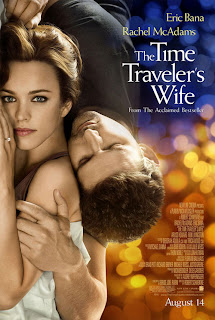 The Time Traveler's Wife movie poster is a different take on the showing of a passionate and loving relationship, the way that the female character is the main focus in the poster due to her eye contact with the viewer shows a softness in her eyes and a little sadness. The way that the photo is on the left side of the photo and it spans the whole length because the viewer doesn't naturally look in the centre of the photo. The movement in the photo gives a natural movement that looks loving and comforting, the male is coming above the women which connotes his power but its contradicted when he is closing his eye to connote weakness. Another connotation of the females positioning is that she is clearly showing her wedding ring finger as well as looking like she is covered by a sheet, this could connote their close relationship as well as their status within the movie. The males positioning in the poster also gives him a sense of softness as he is protecting her as well as holding her softly, another connotation is the way that he is holding his hand to her head, which also suggests their loving, caring relationship. The fact that they are also in focus whilst the background is in a blur gives another connotation that they are important within the movie. The colour scheme of the poster is very dark to very light with the blurs looking like flashing lights, the colourful background also connotes that man being dark and stronger whilst the colour changes as it travels to the women and it changes to a lighter yellow colour which also connotes her weakness and femininity. The font in the poster is white which stand out behind the darker blue background, the way in which it changes also gives a neat layout, its also a 'posh' font as well as having the actors names also close to the title. The title also neatly fits together and isn't all in one straight box but instead is in moved around which is nicer on the eye.
I think that we could take from this poster the way in which the photo is to the side, we could use our photos of the couple to position them in a different way instead of making them the central focus, also the way in which they are in focus whilst the rest of the photo is out of focus makes it eye catching and nicer on the eye, it also gives a soft and sweet feeling.
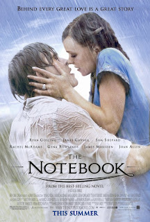 The NoteBook poster is mainly the large photo which focuses on the main relationship within the movie, it gives a dramatic and romantic feeling already at just a first look. The photo of the couple is very romantic, the male is once again taking charge with his arms holding up the female in the shot, however this is then contrasted as he is looking up longingly at her, with his eyes closed which gives a romantic and loving emotion. The female positioning is higher than the males which could connote her power in the relationship but it also shows her looking down on him grabbing his face with her hands which shows a struggle and need for him. The lighting also gives the couple a glow around them which could also connote them as supernatural or giving them a certain power in the poster. The background blends in with their costume which and the 'kiss in the rain' gives a romantic and passionate event which gives the viewer a feel for the whole movie. The colour scheme is soft and pale with pastel colours in the background as well as in their choice of clothing, the natural colours connote innocence and love. The positioning of the couple isn't however totally centre instead they are slightly to the right, this makes it pleasing on the eye and easier to look at, they are also at a slight angle which is going against the angle of the rain fall. The title is in a sweet and simple font which links well with the photo and the sub-note at the top of the poster also gives a clue as to what the movie is about. There is a lot of other information on the poster however it in smaller font.
I think that the poster gives a very romantic view on their relationship and it also looks very passionate. I think that the positioning in the poster could also be the same as in our, I think that we need to show the couple in two different lights, their happiness and their dramatic side.
Another thing that i thought would be useful for us is that take a few ideas from very short film clips that are used as adverts to advertise Chanel No 5 perfume. Even though they are focusing on advertising they still produce very good posters as well as short films. I think that this will give me an even better understanding of how to use a poster to promote what we want to portray as well as the positioning of photographs and text. I have analysed the poster as well as added the short movie 'advert' that it has come from.
The Audrey Tautou advert poster gives a very calm image as the spotlight is on the female, the body language of her stretched pose also suggests lust and gentleness, and it also connotes softness and femininity. Even though it’s a promotional poster its text in white contrasts with the darkness of the photo, as well as its positioning not being straight in eye view makes the viewer wanting to see. The lighting in the photo is very effective, the darkness in the photo connotes romance as well has having the spotlight on the women coming from one side and 'lighting' her up. The setting is also very romantic and 'old' with the typical romantic drama setting of an old train, her costume is also very romantic in a slip dress which is very feminine.
The Nicole Kidman poster is also effective in showing a more dramatic approach; it has her in a closer up position as well as having her head turned. The way that she is turning as well as the hair that is going across her face connotes panic and distress as well as elegance to the photograph. Again even though the text is promotional and white is also again a contrast with the darker background of the photo. The background is not in focus with the lights blurred and it gives a clear indication to the panic that she is going through. Another connotation of the poster is that her outfit is also pale which connotes softness and femininity.
We have decided as a group to each create our own posters and then come together and use all the different ideas to create the best poster that we could. We have chosen to do this so that we each have an opportunity to create our ideas instead of explain them because sometimes explaining them doesn't help and having them visual will help.
I have chosen to go with two very clear cutting photos that aim to give an emotional reaction to the movie as well as portraying the themes of the movie, I want to keep the posters dark and original and the photo I use I don't want to be to posed. The australia poster I liked because of the film footage being used as photos as well as the main focus of the two characters. I think I could incorporate this in to one of my posters for example having them
Music Ideas/ Start of Production
Sunday, 14 November 2010
Editting Second Day Footage
We decided to start from the very beginning of the story board where we first see the girl at a birds eye view angle getting in to bed, we decided that we liked the second shot better as it was a full on birds eye view instead of the side birds eye view like the first one. This is due to the positioning of myself above her when she was getting in to the bed, the first time I was standing to the side of her and the second I was above her. The second scene of her in the middle was more effective because she took up a lot of the screen and it didn't look awkward. We joined this on to the footage we had edited from the first day and we felt that because it is representing her dreaming we needed to add a effect between the two scenes, we added a 'fade to white' in order to establish the transition of reality to 'dream'.
After changing our minds a few times from the tint of the dream being black and white to colour we decided that the natural colour of the dream shots such as the meeting scene was perfectly romantic and we didn't want to waste what we felt was perfect lighting for the effect we wanted to create, we also felt that the black and white being reality could signify the transition from good to bad in the relationship as well as the girls emotions. Therefore we changed the tint from the first day footage back and decided that it looked and fitted a lot better than before hand. The first part with the nice fun memories looked better in colour because the natural light on them made them look more romantic and happy.
Another problem that we felt could alter is the length of the happier part was very long and whilst watching it the audience may forget that they are watching a dream and not reality. Therefore we felt that we needed to have short scenes of her asleep to keep the story flowwing as well as showing her emotions, however because we had thought of this after filming, we have to use the footage that we have which meant splitting up the scenes that we had of her sleeping.
After this we then felt that we needed to change the light on the dark scenes on the bridge without making it grainy however it worked out rather well because it was clearer than the real footage but it was luckily not grainy. The editing applications on IMovie unabled us to make each seperate scene the same instead of having differet lights for each one. Unfortunately we would have liked to not need to do this with our footage but due to our lack of professional lighting and the time of day that we wanted we had no other choice. Overall though I feel that the IMovie editing has made an improvement on the scenes so that it is clearer of the actions.
The next scene that we had to edit was the fight scene which was hard to edit because of the fast pace of each cut and edit, however we managed to add pieces together that look realistic and effective, we stuck to the story board with having choppy angles that change constantly. However during filming we felt that the scene would lose its purpose in the story line so we decided to add dialogue to develop the scene further as well as making it clear. For example the low shot of Harri talking over Max (Luke) gave us a chance to experiment with the story line by making Harri look even more aggressive by threatening Max but also relating it back to the previous part of the film when he looks at the laptop screen.
Throughout editing we had double takes of the footage that we then had to chose which ones we would rather have in the actual film. This video shows the different selections that we had to chose from during editing and the variations that we filmed. Instead of chosing the longer version of him pestering her to answer him and her not answering him totally, we decided to go with the first version where she begins to talk to him first, this was because we felt that it showed her ergency for answers. Instead of her talking we decided to keep it silent so that the audience could feel her emotion more as well as keep the tension. The first scene shown in the film with Harri and the pan cuts his head half of and also isn't steady so we felt that it didnt look very well against our other filming. The second one gives the film a better ending.
Again we have some footage of us directing through out the day and we also have a few scenes that when editing we decided that we didn't want anymore because they didn't fit well or weren't relevant. The first is after the argument scene when Harri has punched Megan and walked out, we wanted to show her love is still there for him however when placing it in the middle of the two scenes we felt that is looked cheesy and unrealistic and it was better to have her straight crying. The yawn scene was cut out because of its irrelevance towards the film as well as its relaxed feeling which should be nervous because in theory he is in the bed next to her. The small pan towards the pillow was also taken out because we felt it looked better in the scene with Harri lying next to it instead of on its own and the night scene was cut because we felt that it was to dark and needed to be down hill to catch the lamp light better. As well as the lamp light being straight in the cameras way.
At the end of editing the second days footage we added the rest of the footage that we had and decided the places in which we wanted to place the title sequence and the credits, we decided to leave her getting in to bed blank and then have the titles coming up in white writing in order to have 'At First Sight' coming up as they lock eyes. We also wanted this at the end of the film with the scene of Harri turning over blank so we moved the credits forward to when she is getting out of the bed and leaving. This film shows the footage that we had at the end of editing, it isn't fully finished as it doesn't have any music in the background and hasn't been totally perfected with edits.
Friday, 12 November 2010
Second and Final Day Filming
At first it look very fake however after practice we got a shot that actually looked very realistic, this helped us to develop our story as well as make it make a bit more clear as to where she gets her black eye, we also had him walk out that added to the drama of the scene as well. Then for convenience we shot all the girls single scenes, we turned down the light and decided to have the girl curled up on the bed but to the left side of the camera frame which created a nice lonely effect, as well as having a teddy bear with her it gave the audience more sympathy towards her.

We then shot the bathroom scene which we had to do at a very careful angle because we didn't want to get the camera in the background of the mirror. The shot on the story board had it as a high angle but we decided that we didn't want them to see her when she was down by the sink because it would mean that we had to cut it constantly and that would lose the flow of the whole scene. Instead we took out the shot 33 instead we had it just with her hand turning on the tap and then watching her go from washing her face to down to going back up to the mirror.

For the bathroom scene half way through we had to do the makeup which I used a slight grey and brown base for then made it darker around the indents of the eye to make it look more real, we also didn't use black which was a typical mistake instead we blended the different colours together to create the effect. We also wanted it to look real and not to over done so we didn't try to make it an over do.

which lead to this
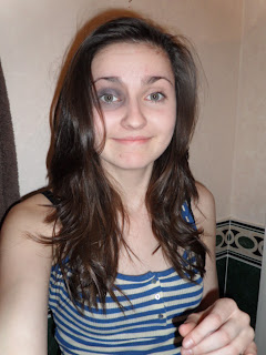
After the bathroom scene we then decided to do all the reality footage, obviously we had to have it as hand held footage because we defiantly wanted the birds eye view angle. We first shot the part where we had the girl get in to bed, obviously we had the high angle with only her in sight with the rest of the bed to her right. We tried two different ways of this, first i stood to the side of the bed but the angle was to hard for me to completely steady the camera so instead i stood all the way over her in order to keep it at a decent angle, we also then had the zoom, which we tried to do slowly but in the end it looked to jagged and we then did it faster which we knew we could edit if needed.
We then filmed shot 27 - 29 which is when she wakes up in the middle of the night, we filmed this first part just as the last part and then we had a behind her shot of her sat on the edge of the bed, she then yawned but we later decided that it was to cheesy and relaxed for what it actually was. After these three shots were filmed the last things for us to film with just Megan was the waking up and leaving. We decided to have the coat hanging on the bed post already to indicate that the time had passed, and then we had the bag at the bottom so when we filmed it from the low angle close up we had the bag and her legs in focus as well as her coat hanging. We kept it at the angle for when she was getting her stuff then we cut to a medium high angle of her placing the necklace on the pillow. Which we had to takes of one of it zooming in to just the pillow and the other of it zooming straight to the necklace. We decided that we would cut it before it fully zoomed anyway. The last scene we had to shot inside was the high angle shot that tracked to see Harri in the bed which again was harder because of it being hand held.
We then went out to shot the outside footage which consisted of Harri catching Megan outside because he was following her and then the fight scene, we went to the top of the bridge in Giffard Park where we had decided to film the follow scene. We first started at the bottom end of the bridge under the street lamp but as they walked away from us we felt that we couldn't see what they were doing especially when he grabs hold of her hand. So instead we stood at the top of the bridge with the street lamp directly in front of us which gave us more light for them to be seen. We had the shot of them walking past and a quick look at him grab her hand which then cut to a close up of their arms which we then decided was to messy and you we rent able to see the whole image. We began trying to decided if we should make it a wide shot but still cutting their top halves off or we could add more action in. In the end we decided to have more dialogue and then to have more action.... which went like this....
- "get off me"
- she pulls her hand towards herself to get rid of him,
- he retaliates and pulls back,
- as he does so he puts his hand over her mouth to muffle her complaints,
- "shut up, i don't need a stupid little girl going around saying stupid stuff about me, do you understand.",
- she nodded,
- "right then your going to do as i say, we're going to go back to yours and your going to act normal. Like nothing has happened."
We decided to have specific dialogue to ensure we got the clear message of his character as well as create more sympathy for the girl, we ended the scene with him dragging her out of the shot down the hill which was actually very effective.
The fight scene was very complected with the positioning of the camera the first big change from our original plan was that we decided in the end we just wanted it to be Harri and Max who was being beaten up, we also decided to give him a weapon which made me look weaker. We filmed the scene that goes after she leaves his house on their anniversary, which worked out exactly to plan with the story board, we also had a really effective shot of her in the front of the shot with him walking away in the background almost out of focus. The first part we shot was at a low height just in line with Harri's hips with him on the left hand side of the screen so you could see Luke who was playing Max on the right side in front of him. We had him slip the metal rod from his arm sleeve which again was very smooth and effective because it had the element of surprise. It went straight into the fight scene as he swung up and caught Luke on the shoulder, we then cut to the front of them to see the reaction shot as well as another hit, we had one over the shoulder shot because Luke had fallen to the floor which was at a high angle, we then had the side shot again but this time closer up to the action, this showed Harri kicking him in the stomach which you could just make out Megan in the background. There is also dialogue in this part, which leads to the point of view shot of Luke looking at Harri as he grabs his shirt, he then talks to him again. This being a very close up of Harri was very effective, this then cut to Megan's behind the shoulder shot. Then the last shot of the fight scene was the point of view shot of Luke again with Harri's legs, the metal pole in his hands and Megan who is watching from a far.
All in all the day was extremely productive and even though we had made a few changes to the story board I think that we need to do this in order to get the best out of the whole short film. We managed to film all of the things that we had planned and more due to your organising and planning which really helped in the long run.
Sunday, 7 November 2010
Editting First Days Footage.
We also experimented with all the different angles that we had with the first meeting scene, we decided that we needed two shots of either over shoulder shot and then it was best to have the long shot because it was a effective shot with the location and lighting. We also then had to edit it so that they crashed together but before the audience saw anything it cuts to the low angle foot shot and sees the possessions falling instead, this was very smooth and effective because it didn't shot them falling but implied what happened in a different shot and angle.
We also had to place all the footage in chronological order because we hadn't filmed it in the way that it had all been laid out, this was easy but we had to remember that we would beediting either side of the piece we had already. Instead of just having his hand on the door handle of the match on action shot we edited it so that he opened it slightly and then on the other side it was already open a little bit this was to make the movement look a lot smoother instead of rigid with a firm cut. This looked a lot more effective because it was a lot smoother and clean.
Another part that we wanted to be smooth and clean was when the phone rang because there ring tone was in each shot, however I managed to adjust the shots to make it sound like it was all one shot, this is a very smooth part of the editing, we had to be careful of how we had her reach for the phone when you look at the phone and there's no phone, therefore we moved the phone ringing to before you see their reaction.


(although it looks grainy, the black and white doesn't always looks like this)This is the tint that we had decided to use on the scenes, the black and white we wanted to use as the dream to signify that they were in the that past and we wanted the tint on the reality to signify that is was a darker and bland instead of being happy.
Once we had edited the rest of that we decided that we needed to have more than what we had anticipated in edits, we used the fade to black, we used it at the start of every scene to make it look effective and it also added to the idea that it was memories and not actually all one story. The editing allowed us to cut down the footage as well as chose the best pieces to put in the film, I'm happy with the way that we have edited so far because all the difficult edits are looking smooth and neat.
Through the sorting of the first days footage we decided to remove a few of the scenes that we had filmed due to them being irrelevant to the movie or not looking very good as far as quality goes. The close up of him smoking we decided to take out as although we wanted a hint of 'bad boy' we wanted to audience to side with him as a gentleman to begin with the make the change larger. The pond scene with them sitting with chips as a first date we scrapped because we felt it wasn't showing time moving on and instead we wanted to show the most romantic scenes that we could, the bench scene was also awkward and uncomfortable and we wanted it to be more lighthearted and fun. The pan of the room was jagged and unsmooth and it didn't fit in well with the film as it took long and wasn't fast paced.
This video shows us directing through out the evening of filming, we had discussing different ways in which the story needs to unfold and the way that dialogue and actions can play a part.
Thursday, 4 November 2010
First Day of Filming.


Once we had filmed at my house we thought it would be a good idea as the sun was still out to film the first date, so we went to the pond and began filming the date. We started filming from behind but we felt that you couldn’t hear properly and you also couldn’t see their facial expressions so it was easier to have them face on, we decided to take a slight low angle shot of them sat at the bend together, we then added a shot of them cuddling together at the pond side, we did this because we felt the light and location were very romantic and it would help develop the relationship for the viewer. After we had shot the pond scene we chose the long stretch of pathway to do the lamppost scene which turned out perfectly with the lighting and the location being very quite and slightly romantic for them, we had to take a few different shots of this because of the wind and the angle that we were at however in the end it turned out to be what we had wanted.
After the Pond scene we then went up the road to the first meeting place, this was a great time to film because the light was perfect where we were, it had a very soft and natural look to it as well as a romantic feel. We also had many different angles here which worked well with the canal location, the over shoulder shots were hand held movements however weren't shaky. We decided that instead of having the hand and head shot of them being next to each other that we would use the tripod to pan upwards from the feet to the faces, this was more effective in one full sweep so that you could see the contact between them.
The last part that we filmed was the Harri's house and it was the anniversary scene. The match on action ran smoothly and we added a shot of them running upstairs to add a bit more to the story line and it was a high angle which gave our shots more variety. We also felt that the story board wasn’t give enough detail on the moment that the viewer was watching so between shot 15-16 we then added a medium shot of them on the bed and we had the two acting out him giving her the present instead of the audience assuming that he had given her it.
I think that we worked productively and quickly, we also hadn't forgotten any props or costume and we worked well as a group, although we haven’t stuck to the story board I feel that every change we have made has added a creative twist on what we wanted to achieve within the scenes
Wednesday, 20 October 2010
Boy and Girl Bedroom Location Choices and Decisions

 Harri and Lukes Bedroom's
We choose Harri's room because it looked more formal and smarter which contradicts the characters real personality, it also looks tidy and well kept which is the opposite of him. We also wanted there to be a very minimal room so that we were able to take different angles easier as well as make it look like he isn't bothered by his room.
First Date Location Choices and Decision
The Pond - We decided that the pond would be the most romantic place for them to have their first date, we wanted it to be memorable for her so we decided there was more chances at the pond to create romance, for example the medium angle shot that we have with them cuddling looking at the pond, we also liked the setting as it was more natural and nicer to the eye. We wanted is to be romantic to show the fact she remembers him as this person instead of the bad person, we also decided to have him sat waiting to suggest that he chose the place, which also gives the 'nice guy' impression.
School Grounds was another possible place for us to shot the first date scene, however we felt that because it was a primary school we wanted to be in a more adult place with a romantic feeling. The school would have given the date a more childish feeling instead of romance that we wanted.
Fish and Chip shop Bench - the fish and chips shop would have been a typical place for them to have their first date because of the chip shop in the background, however we thought that it is associated with anti-social behavior and therefore we don't want any clue's to his real behavior.
Possible Meeting Places Location Choices and Decisions
 Number 1 - The street side walk would have been a nice place for them to meet but we felt it was to open for them, we wanted somewhere that was secluded and we felt that the lamp post that is further ahead in the photo would be better for the shot of them hugging together.
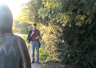
 Number 2 - This was the darker place that we suggested for the meeting scene, but we felt that it was to dark and 'dodgy' for them to meet and we wanted it to be a light and peaceful place. We however want to use the setting for the fight scene and the photo shows what it will look like.
Monday, 11 October 2010
Character - Boy


The main factor that we wanted to have for the boys character was the element of surprise for his darker side, which is the main reason that we chose Harri. He has an innocent looking face as well as not being as big built as the other two boys. We also wanted to subvert the typical stereotype of a abusive boyfriend and therefore we chose the weaker and innocent looking guy.
Character - Girl


(Megan, Olivia and Louise)
In the end the character profile that we had for the girl was to be petite and thin, this was to show her weakness physically as well as emotionally. We decided that the way we all pictured her as a group would be dark and timid, which is why we choose Megan in the end. The way that she looks more innocent that Louise and myself is very similar to the character we wanted to portray. She also has the pale faced/dark hair complexion which works for making her look innocent and weak and will be very handy for the 'bruised' scene.
The clothing that we chose was very girlie and delicate to give her a stylish but weak spot, her clothing was attractive to show that the boy would fall for her and we also wanted others to be able to relate to her innocence. We chose for her to be fashionable instead of 'nerdy' or 'boring' so that it added to her character being 'real' and once again more relatable.
Friday, 8 October 2010
Planning

The first day of filming we hope to get a lot of the first section of the short film done and ready for edtiting after all the filming is done. We decided to get the first set of scene finished when the relationship is developing through her memories, it gave us a chance to let the actors get used to the characters and each other as well as help us get the simple filming done and get used to the camera.
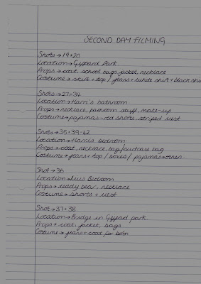
The Second day that we will film is based on the rest of the memories and the reality scenes, in the middle of our story board we have the fight scene which we have decided to have as a seperate day of filming to ensure we get the best footage and aren't rushing against time. There are more locations for us to visit on the second day but with the planning sheet we will be able to keep on top of correct props and timing of the day for lighting.
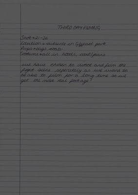
This is the planning sheet for the fight scene, which we are wanting to look as realistic as possible which is why we have dedicated so much time to filming it.
Thursday, 7 October 2010
Story Boarding
We then had a discussion about the 'key bedroom' location and what we thought it should be, we realised that if it was at the girls house then why would she leave her own house with him there but then if she was at the boyfriends house then she would have a suit case there which would be a bit difficult. But we decided to have a large bag with her sleepover stuff. Although we have many different locations we will have the problem with lighting however the natural lighting will add to the realistic view. As well as the whole lighting giving the atmosphere a clear view such as at night with the 'fight scene' giving it a darker menacing look. Louise made a good point about the flashbacks being the important memories of their relationship so we were trying to picture the most important things that she would remember about the relationship such as the fight which shows his different side. We have decided to have it through her eyes and the victims with the use of camera angles and an over the shoulder shot.We have also decided to use one of the possible meeting places as the fight scene due to its thin path and darkness. The fight scene is going to take up the most shots with jump cuts back and forth from the girls reaction to the boys fighting. We have an interesting track of the guy he is beating up POV shot that falls with him and sees the girl in the background. We have decided to then have a reaction shot of the girl, showing her emotions. There are two ways in which we can have her react - running away or break down, we have decided for her to run away.


